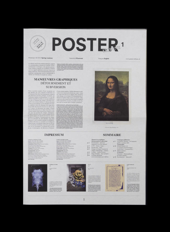
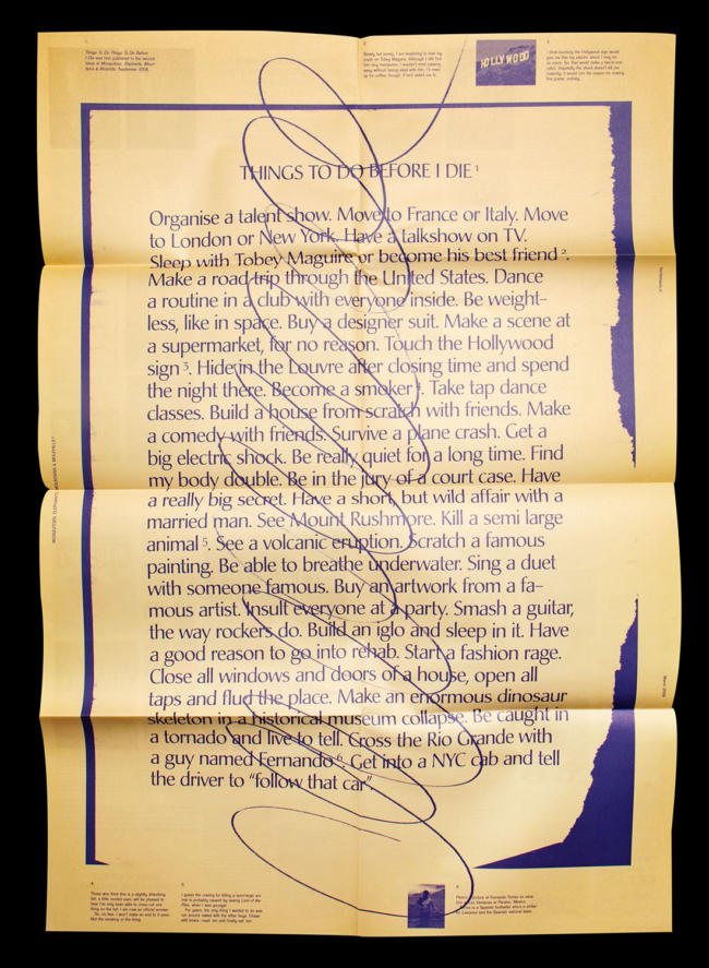
Title: Poster Tribune #1
Year: 2011
Theme: Détournemnet & Subversion
Awards: Swiss Design Award, 2012
Language: English / Français
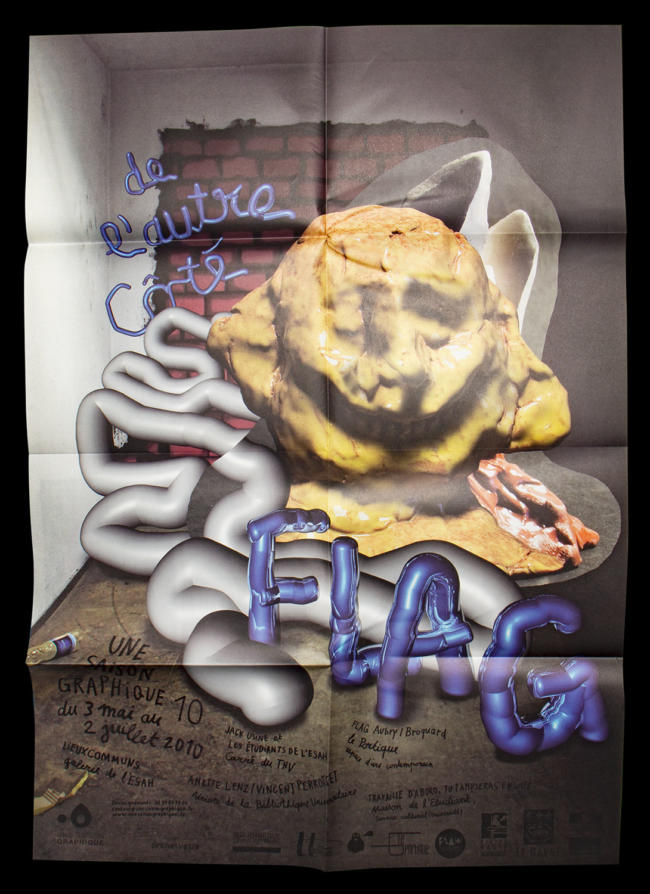
3 posters included (66 x 95 cm):
Federal Studio, FLAG, Bart de Beats
Description:
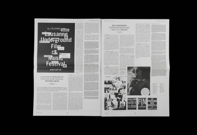
For this first issue, Poster Tribune looks into posters that, not content with promoting their specific event, bring a new poetic or offbeat dimension through the skilled use of détournement. The public can relate to these posters because they counter conventional images that we are used to. The détourned poster is based on an analogy or a metaphor of the poster’s focus. The graphic designer chooses to distort an image to give it a totally new function than that which was originally intended. By détourning an image, the focus takes on a new dimension. In a way, it then forms part of the designer’s approach and is no longer ‘merely’ from the illustrator’s perspective. The subversive poster has neither the same aims nor the same challenges. It focuses on upsetting existing values and deliberately imposing an image that goes against what is expected ; without there being the slightest analogy or metaphor. The subversive poster tries to be free and demands pure creativity. It has a Dada style (although it is not often a conscious legacy), which does away with convention, often playing with extravagance, derision and humour. In some respects, the détourned or subversive poster is a means of giving the item it is promoting a ‘different’ perspective. It characterises our generation by revisiting and reinterpreting references from other times, styles and contexts. But first and foremost, it is also a way for today’s graphic designer to be an author, poet or designer in an infinite world of abundant images.
Contributors: Ramaya Tegegne, Notter+Vigne, Federal Studio, Atelier Poisson, Flag, Bart de Baets, Jean-Charles Groud, Anne Voneche, Mathieu Christe, Emmanuel Rey, Schönherwehrs, Charlotte Cheatham
→ Buy it: Ligature Books
